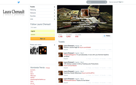
Twitter's new layout is keeping me busy! My personal account is linked to my art site and was long overdue for a new look. I had honestly gotten a little tired of the pile of my sketchbooks, but hadn't bothered to update it. I went from this…

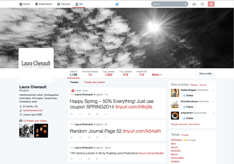
… to this. I chose an image from my artist book, La Sonámbula, and replaced the very blurry self portrait with my logo. The large photo across the top is especially fun to play with! I'll probably change it more often.

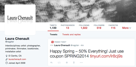
Here's a closer look at the logo and my pinned coupon post! I think this is a really great feature, especially because tweets fly by so quickly.
