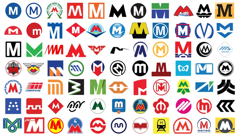
Citylab has the excellent round up of the use of the letter "M" in metropolitan logos around the world. Gathering 77 different M's from public transportation systems, author Eric Jaffe groups them by style and compares and contrasts their varying features.

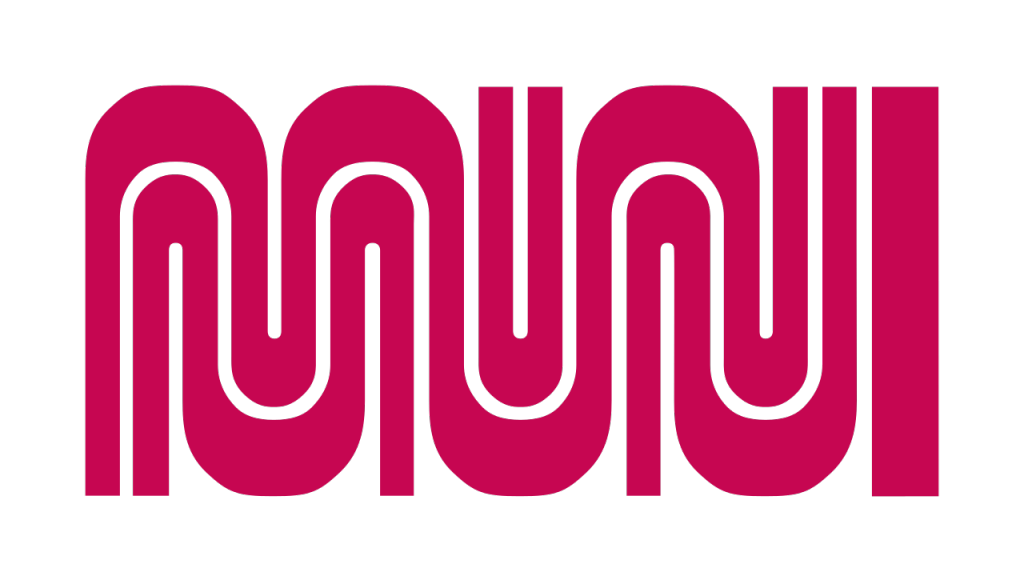
I'm a little sad that they didn't include the MUNI worm, but I can see that it would be difficult to isolate the M.
