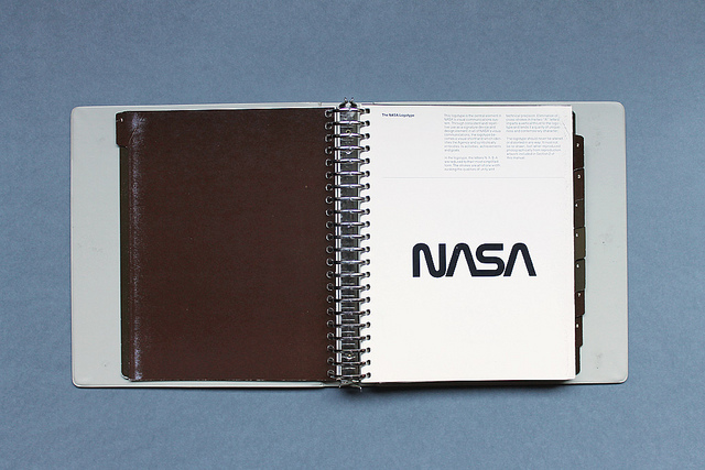
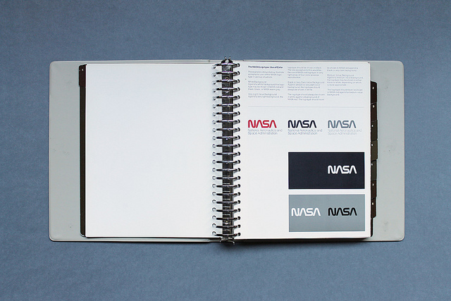
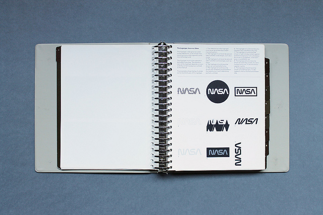
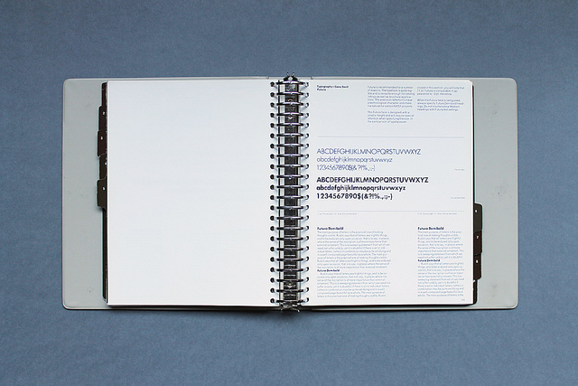
This comprehensive style guide for NASA is beautifully designed. The classic NASA worm is iconic and this photo set shows off it's flexibility and sets the design standards for the agency.
The album's description is as follows:
The National Aeronautics and Space Administration Design Program is a modernist vision for an optimistic future. The logo (often referred to as "the worm") evokes qualities of unity, technical precision, scientific capabilities and uniqueness. Reduced to its simplest form; the one width, continuous-stroke letters are as contemporary today as when the logo was first introduced.
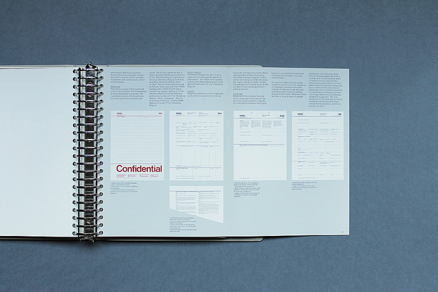
via Reddit user Geographist in the Typography subreddit
Some rights reserved. The full photo set is here and Display has a comprehensive analysis.