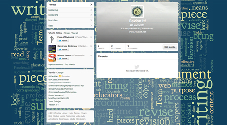
The Revise It! Team wanted to update their Twitter graphics to take advantage of the new layout. Here's what it looked like last week...

And here's what it looks like now!

Opting for the word cloud as the header takes full advantage of the scaling area. The larger profile image allows Revise It! thumb's up logo to display a lot clearer.

Their current coupon gets featured when pinned to the top of their page.
