Highlight

Clever Redditor dmpini has chosen the perfect combination of surface, writing utensil, and text to create this brilliant GIF.
Clever Redditor dmpini has chosen the perfect combination of surface, writing utensil, and text to create this brilliant GIF.

Casey Ligon is a talented calligraphy artist who brings her unique style to paper, chalkboard, and a wide variety of inanimate objects. Bright and optimistic, even in black and white, I love her casual, whimsical style. Definitely click over to her website where her lettering portfolio is organized in rainbow order.

Just Breathe is a gorgeous piece by Parisian designer Mario De Meyer for the Memodarium calendar project. I like this piece because of the contrast and balance. It looks amazing in one color and full color. The message is what really makes it powerful for me and reminds me of a time these simple words made a co-worker's day.
This comprehensive style guide for NASA is beautifully designed. The classic NASA worm is iconic and this photo set shows off it's flexibility and sets the design standards for the agency.
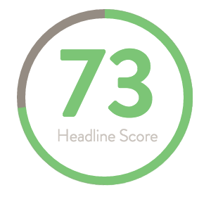
CoSchedule has a cool headline analyzer tool for content creators. This blog post was originally called "Creating Powerful Headlines" which receives an whopping 33%. Disappointing and clearly I should be able to do better.

I love this lettered quote by Reddit user hojumoju. Their handwriting and formal lettering is perfectly framed with the simple gold border. The white on black makes it especially striking.

Nathan Godding's fluid fifty is just really the perfect example of form meets function. I really love the way the letters flow from one to another. The way the tittle of the letter is replaced by the end of the f is simply beautiful.

I wrote about Gemma O'Brien before, but this piece is vibrant and I just had to share. The idea of charging into battle as part of the creative process really speaks to me. Maybe I'm just being introspective because it was my birthday yesterday. Here's to another trip around the sun!

This lettering for Park Hill Colorado by Adam Vicarel is gorgeous. I always enjoy seeing in progress work and this one is especially nice. The variety of line weights and letters help it easy to read and include a lot of information in a relatively compact space.

When I'm doing print work, my number one font choice is Garamond. I find it easy to read and I probably have 20 different variations of it on my computer. I try other fonts, especially ones that have web versions, but I come back to Garamond - The Original. The Original Gangsta, that is. At least according to this awesome poster by Michael Lashford.